
Track project milestones, budgets, resource allocation, and team utilization at a glance.
What this page is for
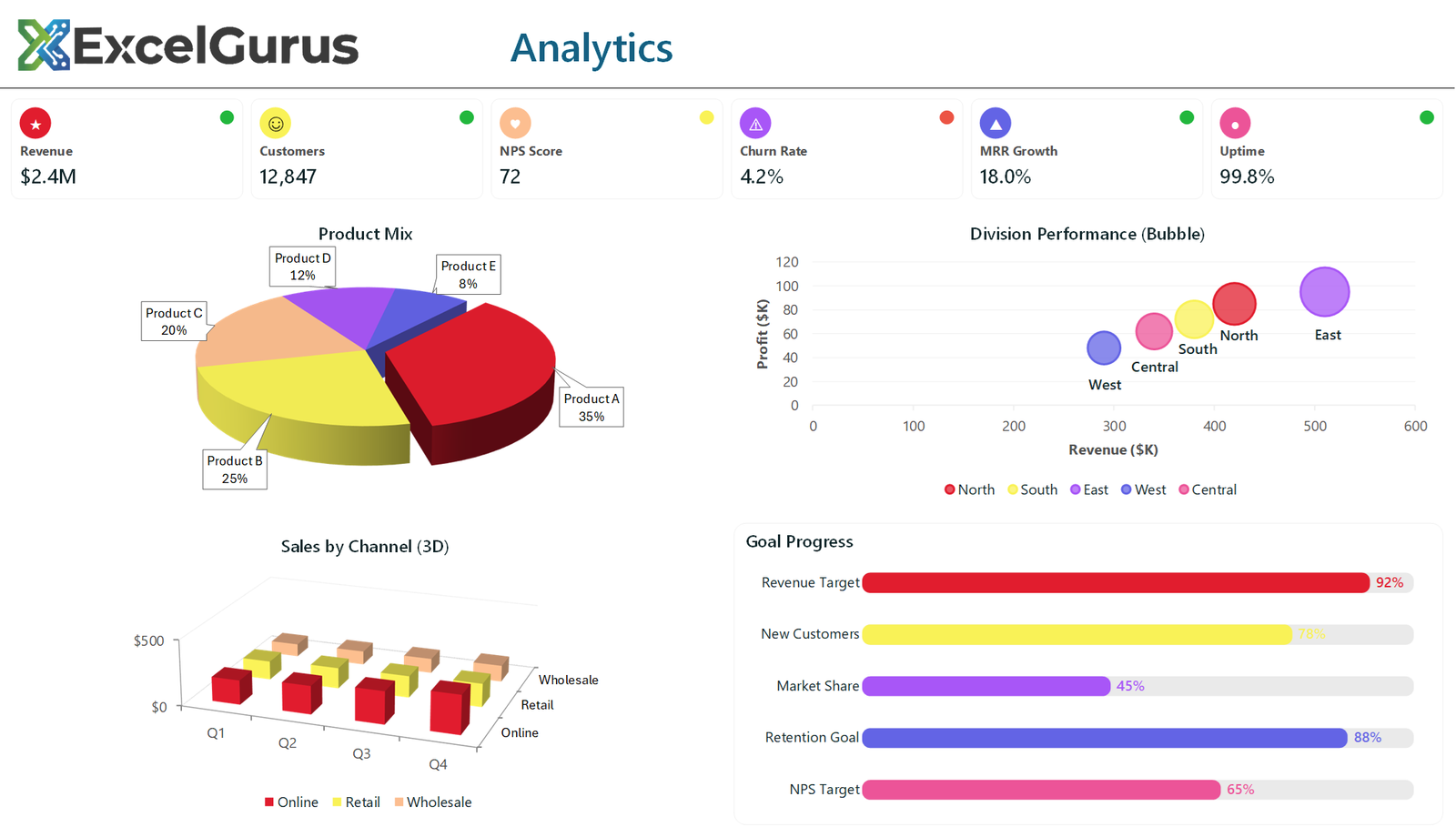
This one is deliberately a range of techniques rather than a coherent report: icon KPI cards, an exploded 3D pie, a bubble chart, a 3D column chart and a set of progress bars. It exists to show what is achievable in Excel without add-ins, so a specific requirement can be matched to a method.
Icons without icon files

Every icon here is a Unicode character rather than a picture: a star through ChrW(9733), a smiley through ChrW(9786), a heart, a warning triangle. Each sits in a text box over an oval shape filled with the card’s color, with a smaller oval in the corner as a status light.
Because they are characters rather than images, they stay sharp at any zoom, recolor in one line, and add nothing to the file size. Embedding icon files would do none of those things.
Progress bars made of two rectangles
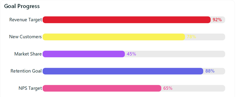
The goal progress panel is not a chart. Each row is two rounded rectangles: a gray track at full width and a colored bar on top whose width is the percentage of that width, with the corner radius pushed up through .Adjustments.Item(1) = 0.4 to round the ends.
A bar chart could show the same numbers but not this way. Drawing them as shapes gives exact control over height, spacing and end caps, and the whole panel is generated by one loop over the five goals.
The 3D charts, and when not to use them
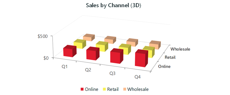
The 3D pie and 3D column are native Excel chart types, set with xl3DPie and xl3DColumn, with .Elevation and .Perspective adjusted in code and one pie slice pulled out using .Explosion.
Worth being honest about these: 3D perspective distorts the very comparison a chart is supposed to make, and slices nearer the viewer look larger than they are. They are included here because clients ask for them and because the technique is worth knowing, not because they are the right choice for a report anyone has to act on.
How it is built
Everything on the sheet is drawn by VBA: shapes, text boxes and native Excel charts, positioned by absolute coordinate. There is no image, no add-in and no ActiveX control, so the file opens on any Windows Excel with nothing to install.
About this example
This is a demonstration build using sample data. It represents a typical system that our clients ask us to build for them, produced entirely in Excel and VBA so that every part of it can be rebuilt from scratch on demand.
If you’ve seen a chart style you want recreated in Excel, send us a screenshot and we’ll build it. → Get Excel Help