
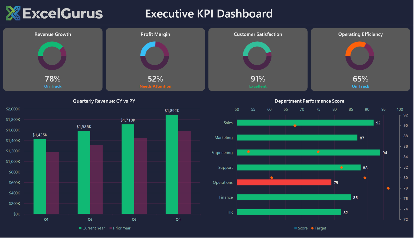
Dark-themed executive view with four KPI gauges, a year-on-year revenue comparison and a department scorecard.
What this dashboard shows
Four gauges across the top track Revenue Growth, Profit Margin, Customer Satisfaction and Operating Efficiency, each showing a percentage with a status word beneath it. The status is not typed in: thresholds in the code decide whether a figure reads Excellent, On Track or Needs Attention, and color the word to match.
Below that, a quarterly revenue chart compares the current year against the prior year, and a department performance chart ranks seven teams by score, each bar carrying a separate marker for its target.
How it is built
Everything on this sheet is drawn by VBA. There is no image, no add-in and no ActiveX control anywhere in it. That matters for a dashboard that gets emailed around: it opens on any Windows Excel with nothing to install.
The gauges are doughnut charts, not gauge charts
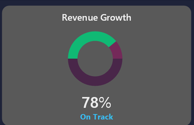
Excel has no gauge chart. Each of these is an ordinary doughnut chart with its hole size widened, its plot and chart area fills switched off so the card behind shows through, and each slice colored individually through Points(n).Format.Fill.ForeColor.RGB rather than by any theme.
The percentage and the status word underneath are separate text boxes rather than chart labels, which is what allows them to be sized and positioned freely. The card behind each gauge is a rounded rectangle shape with its corner radius set through .Adjustments.Item(1), giving a softer corner than Excel’s default.
The department chart is two chart types in one
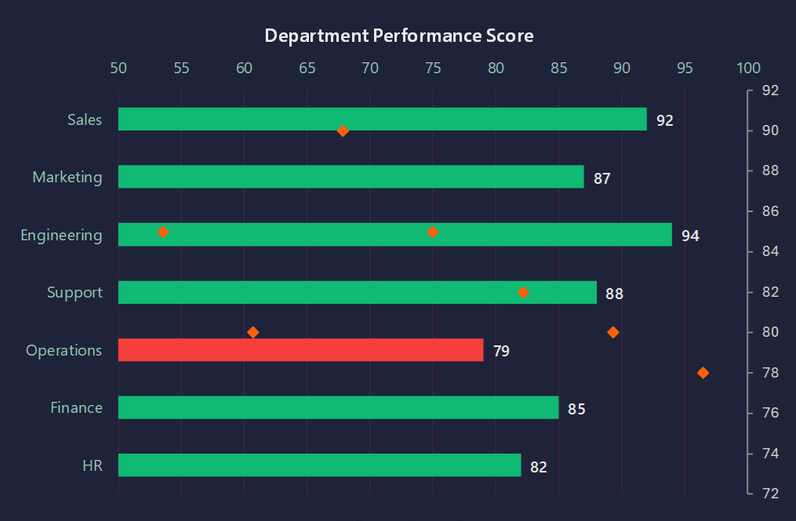
The score bars and the target markers live in a single chart object holding two series. The first is a clustered bar. The second is added and then switched with .ChartType = xlLine and given xlMarkerStyleDiamond, with the line itself hidden, so it renders as markers floating over the bars. Bars that miss target are recolored individually in a loop over the points.
This is the usual way to build a bullet chart in Excel, because there is no bullet chart type either.
Why it does not look like Excel
Two things do most of the work. Every element is positioned by absolute coordinate rather than dropped into cells, so the layout does not shift when a row is resized. And chart backgrounds are made transparent so the cards behind them provide the color, instead of each chart sitting in its own white box.
The whole sheet is generated from a single routine that deletes and rebuilds it, so changing the palette or the layout means editing constants at the top of a module rather than dragging anything around.
About this example
This is a demonstration build using sample data. It represents a typical system that our clients ask us to build for them, produced entirely in Excel and VBA so that every part of it can be rebuilt from scratch on demand.
Who it suits
Leadership views where the reader wants a verdict rather than a table: monthly board packs, operations screens, anything that needs to be readable across a room. It replaces a subscription dashboard tool with a file that can be emailed and opened by anyone.
Ready to Build Something Like This?
Need a command center view of your business? Tell us what metrics matter most and we’ll build you a dashboard your leadership team will actually use. → Get Excel Help