
Visualize headcount, turnover, recruitment pipeline, and workforce demographics in one view.
What this dashboard shows
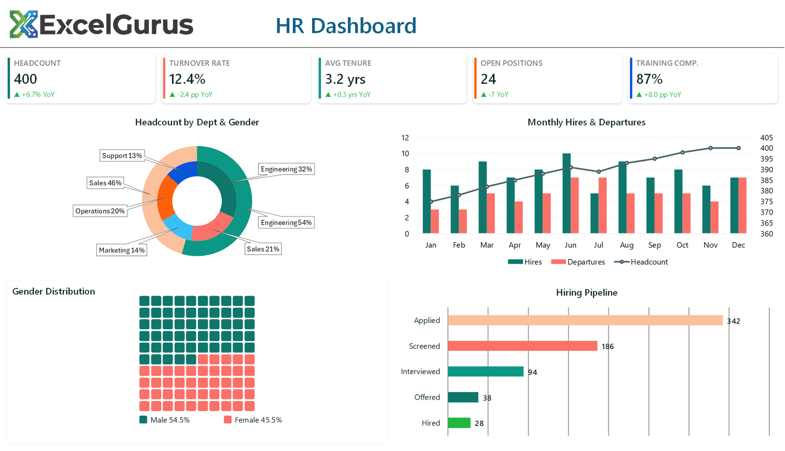
Five KPI cards cover headcount, turnover rate, average tenure, open positions and training completion. Below them, headcount is broken down by department and gender in a single nested ring, monthly hires and departures are plotted against running headcount, gender split is shown as a grid of squares, and the hiring funnel runs from applications through to hires.
The gender chart is not a chart
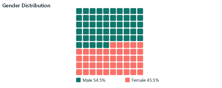
This is a waffle chart, and Excel has no such chart type. It is one hundred small rounded rectangles drawn by a nested loop, ten rows by ten columns, each positioned by calculating its own offset from the grid origin. The loop keeps a running count and switches fill color once it passes the male percentage.
Because each square is one percent, the reader counts rather than estimates an angle. It is a better way to show a simple split than a pie chart, and it costs nothing but a loop.
Two rings in one doughnut
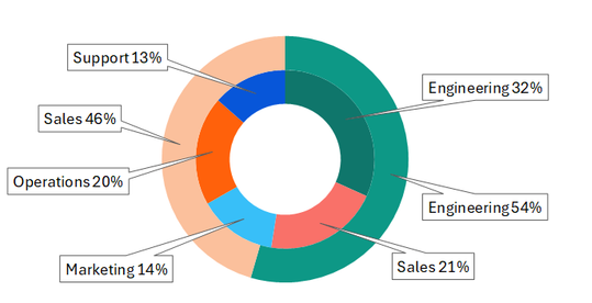
The department and gender breakdowns are two series added to the same doughnut chart. Excel draws additional doughnut series as concentric rings automatically, so the outer ring becomes department and the inner ring the split within it, with the hole size set to keep both readable.
This shows a hierarchy in the space of one chart, which two separate pies could not do.
Headcount on a second axis
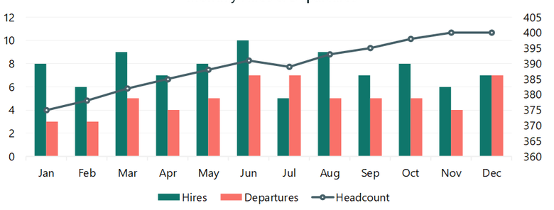
Hires and departures are single figures each month; headcount is in the hundreds. Plotted together on one axis, the columns would vanish. Headcount is moved to a secondary axis as a line series, so monthly churn and overall trend can be read from the same chart.
How it is built
Everything on the sheet is drawn by VBA: shapes, text boxes and native Excel charts, positioned by absolute coordinate. There is no image, no add-in and no ActiveX control, so the file opens on any Windows Excel with nothing to install.
About this example
This is a demonstration build using sample data. It represents a typical system that our clients ask us to build for them, produced entirely in Excel and VBA so that every part of it can be rebuilt from scratch on demand.
Who it suits
HR teams reporting headcount and attrition to a board or an executive group, where the same six views are needed every month from an export that arrives in a slightly different shape each time.
Ready to Build Something Like This?
Whether you track headcount, turnover, recruitment, or all three, we can build an HR dashboard that updates itself. → Get Excel Help