
Track revenue, pipeline, and rep performance with automated KPI cards and interactive charts.
What this dashboard shows
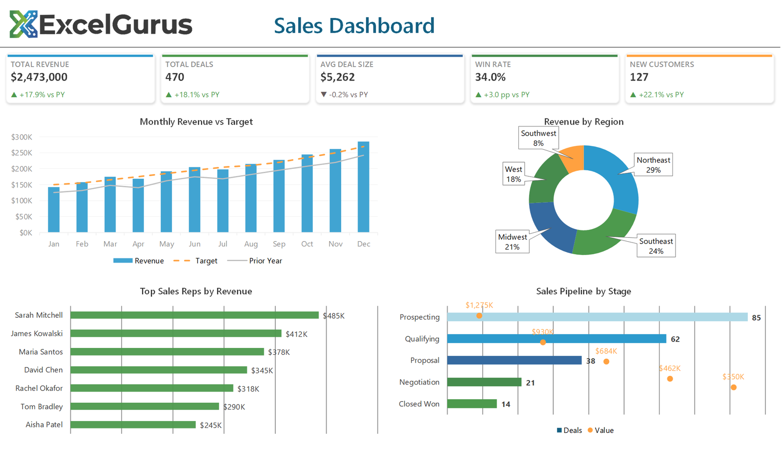
Five KPI cards run across the top: total revenue, deals closed, average deal size, win rate and new customers, each showing the figure and its movement against the prior year. Below them, monthly revenue is compared against both target and last year, revenue is broken down by region, sales reps are ranked, and the pipeline is shown stage by stage.
The KPI cards are shapes, not cells

Each card is a rounded rectangle shape with a thin rectangle laid across the top as an accent bar, then three text boxes for the label, the figure and the change line. Building them as shapes rather than merged cells means the layout holds together no matter what the user does to row heights.
The up and down arrows are characters rather than images, inserted with ChrW(9650) and ChrW(9660), and the direction and color are chosen in code from the sign of the change. That keeps them crisp at any zoom and avoids shipping icon files inside the workbook.
Three series, two chart types, one chart
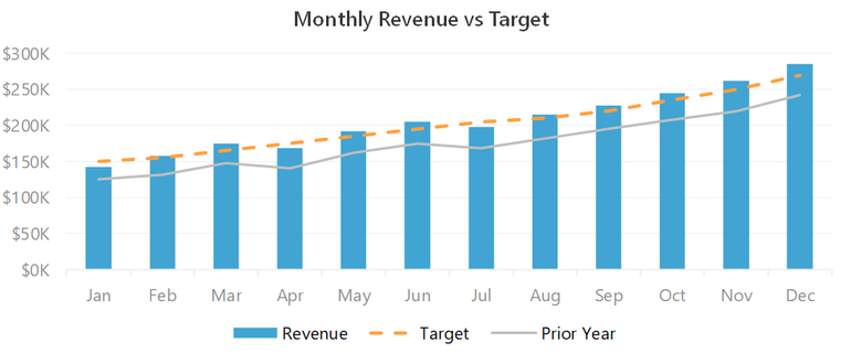
Revenue, target and prior year sit in one chart object. The first series stays as clustered columns; the second and third are switched to xlLine. Target gets msoLineDash so it reads as a goal rather than an actual, and prior year gets a plain gray line so it recedes behind the current numbers.
Deciding what each series should look like in code, rather than accepting the chart defaults, is most of what separates this from a standard Excel combo chart.
The pipeline mixes counts and values on one chart
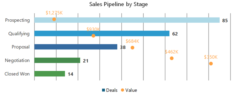
Deal count and pipeline value are different units, so they cannot share an axis. The bars carry the counts; the values are added as a second series set to AxisGroup = xlSecondary, switched to a line with circular markers and the line hidden, so each stage shows both numbers without either being squashed.
The bars are also colored point by point in a loop, lightest at Prospecting and strongest at Closed Won, which gives the funnel its sense of direction without any conditional formatting.
How it is built
Everything on the sheet is drawn by VBA: shapes, text boxes and native Excel charts, positioned by absolute coordinate. There is no image, no add-in and no ActiveX control, so the file opens on any Windows Excel with nothing to install.
About this example
This is a demonstration build using sample data. It represents a typical system that our clients ask us to build for them, produced entirely in Excel and VBA so that every part of it can be rebuilt from scratch on demand.
Who it suits
Sales managers and directors who currently rebuild the same pack every month from a CRM export. Once the data lands in the sheet, the whole view regenerates without anyone reformatting a chart.
Ready to Build Something Like This?
Every business tracks sales differently. Tell us about your data and reporting needs, and we’ll design a dashboard that fits your workflow. → Get Excel Help