
Automated product sales report combining chart visualizations with structured data tables.
What this report shows
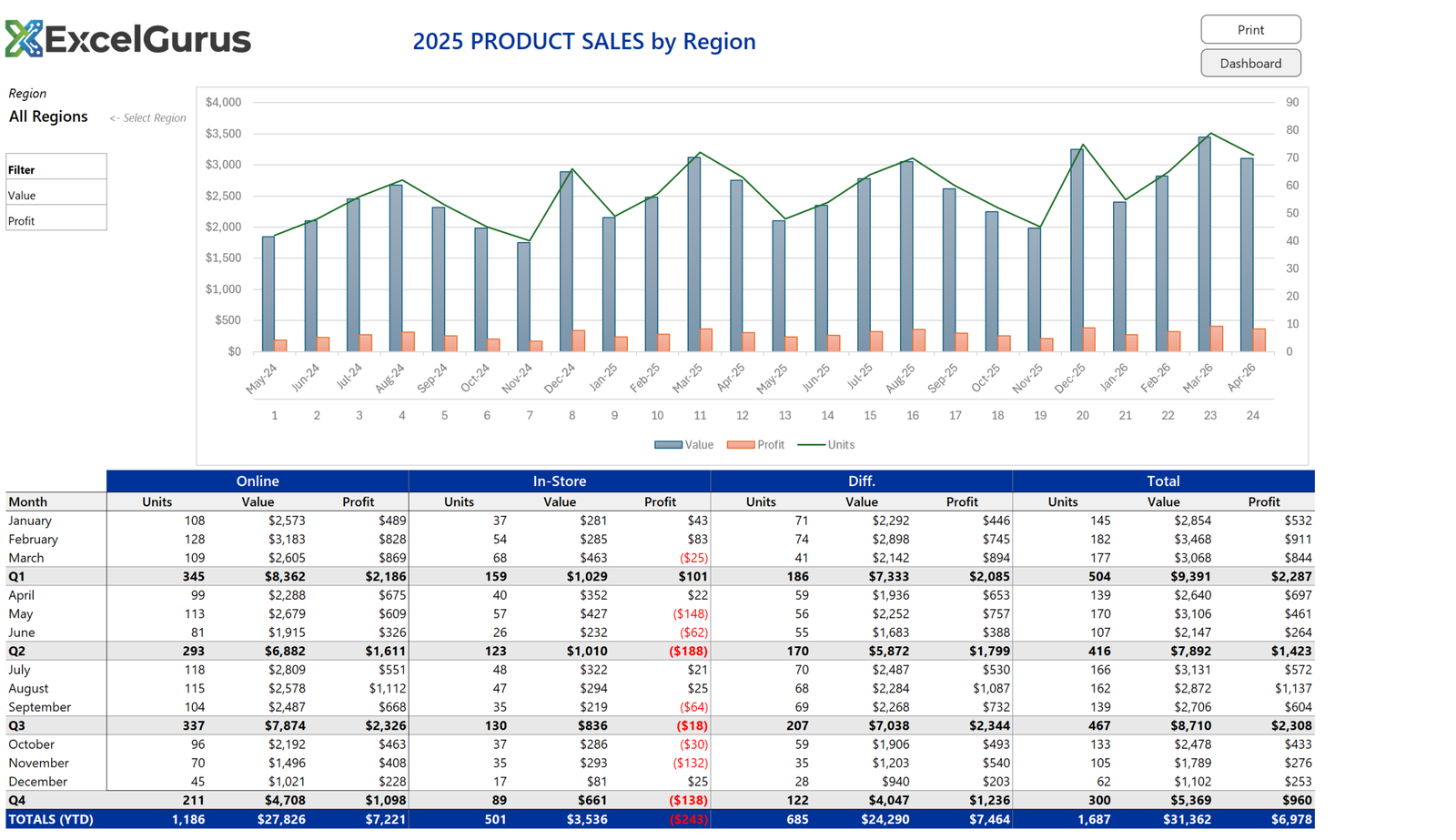
Two years of monthly sales as a chart, then the same data as a table split by channel, with quarter subtotals and a year-to-date row. A region selector at the top left filters the whole thing, and there are buttons to print or jump to the dashboard.
This one is deliberately different from the dashboards. It is a report meant to be printed and read, not a screen to be watched, so it lives on the worksheet grid rather than being drawn in shapes.
Two-level headers built with merged ranges

The header is two rows. The top row merges three columns per channel through Range(Cells(r,2), Cells(r,4)).Merge and repeats across Online, In-Store, Diff. and Total. The row beneath carries Units, Value and Profit under each group.
Merged cells are usually a bad idea in a working sheet because they break sorting and selection. In a report that is generated and then read, they are the right tool, and generating them in code means they are rebuilt correctly every time rather than being nudged out of shape by hand.
Subtotals as part of the build

Quarter rows are not formulas added afterwards. As the table is written, the routine tracks which month it is on and inserts a subtotal row after every third one, applying bold and a gray fill at the same time. The year-to-date row at the bottom gets the header color instead.
Negative profits show as red figures in parentheses, which is a number format applied to the range rather than conditional formatting, so it survives copying the report elsewhere.
Units and money on one chart
Value and profit are in dollars; units are counts in the tens. The first two are clustered columns, and units are added as a third series moved to a secondary axis and switched to a line. Without that, the unit line would sit flat along the bottom and tell you nothing.
About this example
This is a demonstration build using sample data. It represents a typical system that our clients ask us to build for them, produced entirely in Excel and VBA so that every part of it can be rebuilt from scratch on demand.
Who it suits
Reporting that has to be printed, emailed as a PDF, or read by someone who will not open a dashboard. The work it removes is the monthly rebuild: the layout, subtotals and formatting are regenerated from the data rather than maintained by hand.
If your team builds the same report every week or month, we can automate it so it generates with one click. → Get Excel Help