
Monitor revenue, margins, budget utilization, and financial trends with automated progress indicators.
What this dashboard shows
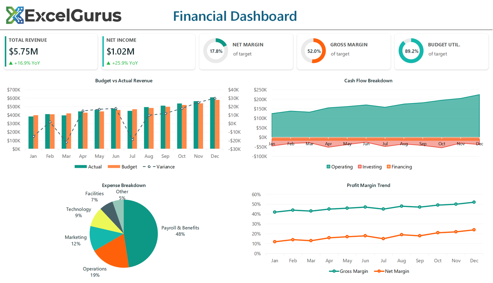
Two plain number cards for total revenue and net income sit alongside three progress rings for net margin, gross margin and budget utilization. Below them, budget is compared against actual with the variance overlaid, cash flow is broken into operating, investing and financing, expenses are split by category, and margin trends run across the year.
Progress rings built from a two-slice doughnut
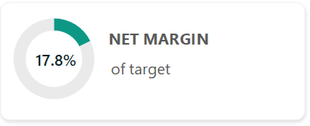
Each ring is a doughnut chart with exactly two slices, the value and the remainder. The remainder is filled with a pale gray so it reads as an empty track, both slice outlines are switched off, and DoughnutHoleSize = 70 opens the middle enough to hold a number.
The percentage in the center is a text box positioned over the chart, not a data label. Excel gives you very little control over label placement in a doughnut, so putting the number in its own shape is what makes it sit exactly in the middle at a readable size.
Variance on its own axis
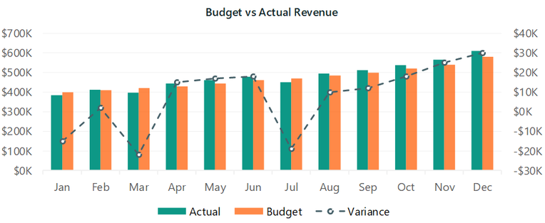
Actual and budget are paired columns. Variance is the interesting number but it is tiny next to the revenue figures, so plotting it on the same axis would flatten it against zero. It is added as a third series with AxisGroup = xlSecondary, switched to a dashed line with circular markers, and given its own scale on the right.
That is the whole trick: two different orders of magnitude in one chart, without either becoming unreadable.
Stacked areas with transparency
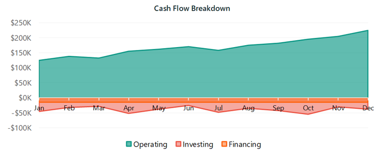
Cash flow uses three area series, each with its fill transparency set individually through .Format.Fill.Transparency. Solid areas would hide whatever sits behind them; partial transparency keeps all three bands legible where they overlap, including the negative financing band below the zero line.
How it is built
Everything on the sheet is drawn by VBA: shapes, text boxes and native Excel charts, positioned by absolute coordinate. There is no image, no add-in and no ActiveX control, so the file opens on any Windows Excel with nothing to install.
About this example
This is a demonstration build using sample data. It represents a typical system that our clients ask us to build for them, produced entirely in Excel and VBA so that every part of it can be rebuilt from scratch on demand.
Who it suits
Finance teams producing a monthly board pack. The work it removes is not the arithmetic, which Excel already does, but the hour spent reformatting six charts so the pack looks the same as last month.
Ready to Build Something Like This?
Whether you need monthly board reports, budget trackers, or financial dashboards, we can automate the process. → Get Excel Help