Track project milestones, budgets, resource allocation, and team utilization at a glance.
The Challenge
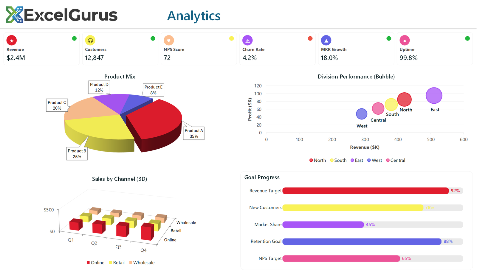
A visual capabilities showcase featuring 3D charts, bubble analysis, and advanced chart techniques.
Why This Exists
This dashboard exists for one reason: to demonstrate that Excel VBA can produce virtually any type of data visualization. If you have seen a chart style in a boardroom presentation, a BI tool, or a design mockup, chances are it can be built in Excel.
What’s Included
The showcase features six icon-based KPI cards with traffic light status indicators — each card displays a key metric with a colored dot (green, amber, or red) showing whether performance is on target. Below the cards, a 3D exploded pie chart shows product mix breakdown with rotated perspective and elevated viewing angle.
A bubble chart maps division performance across three dimensions simultaneously: revenue on the X-axis, profit on the Y-axis, and employee count as bubble size. Each bubble is color-coded by division, providing a complete performance picture in a single view.
3D grouped column charts display quarterly sales by channel (online, retail, wholesale) with perspective rotation that adds depth and visual interest. Thermometer-style shape-based progress bars show goal attainment across five different metrics, offering an alternative to traditional bar charts that clients consistently find more engaging.
How It Works
The sunset gradient color palette ties everything together with warm oranges, ambers, and corals that give the dashboard a distinctive, modern feel. All chart elements are generated programmatically — the VBA code creates every shape, formats every color, and positions every element.
The Point
This piece is specifically designed as a portfolio showcase. It demonstrates to potential clients that ExcelGurus can handle any visualization request, from standard bar charts to advanced 3D graphics and custom shape-based indicators.
Technologies Used
Excel VBA · 3D Charts · Bubble Charts · Shape-Based Indicators · Advanced Data Visualization
Have a Specific Chart or Visual in Mind?
If you’ve seen a chart style you want recreated in Excel, send us a screenshot and we’ll build it. → Start a Project