Monitor revenue, margins, budget utilization, and financial trends with automated progress indicators.
The Challenge
Finance teams often spend hours every month pulling numbers from accounting systems, pasting them into Excel, and manually building reports for leadership. This custom financial analytics dashboard automates the entire process.
What This Dashboard Does
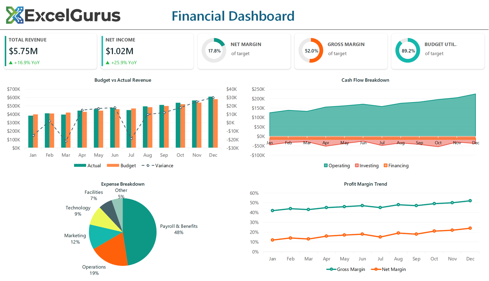
The dashboard opens with five KPI cards showing total revenue, net income, net margin, gross margin, and budget utilization — each with progress doughnut indicators that fill based on performance against targets. The visual impact is immediate: leadership can see financial health in seconds without digging through spreadsheets.
A revenue and expense area chart shows monthly trends over the past twelve months, making seasonal patterns and anomalies easy to spot. A dual-line chart tracks net margin and gross margin side by side, helping finance teams identify when costs are eating into profitability.
How It Works
The teal and amber color scheme was chosen for professional readability — it works equally well projected in a conference room or printed in a board packet. All charts and indicators update automatically when new data is entered, so month-end reporting becomes a matter of refreshing the source data rather than rebuilding the entire report.
Who It’s For
Built entirely in Excel VBA, this dashboard requires no external tools, subscriptions, or technical skills to operate. It is particularly well-suited for CFOs, controllers, and financial analysts at small to mid-size companies who need board-ready reporting without investing in dedicated BI software.
Technologies Used
Excel VBA · Progress Doughnut Charts · Area Charts · Financial KPIs · Automated Formatting
Ready to Build Something Like This?
Whether you need monthly board reports, budget trackers, or financial dashboards, we can automate the process. → Start a Project